TAPADA DE MAFRA PARK
Branding
April 2021
Project Goal
The Tapada de Mafra park was rebranded for an academic project.
Before starting to create the brand's visual identity, research was carried out on it to obtain as much information as possible to help with the development of the process.
All this research resulted in the construction of a creative brief with several questions and answers about the brand.
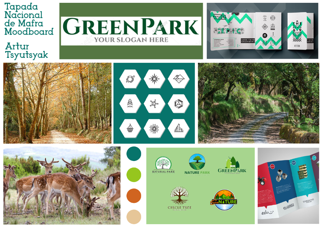
Moodboard
After the research a moodboard containing some inspiration items was created. In this moodboard we can see font styles, colors, icons, logos and photos that were in line with the style I wanted for the brand.
Logo Construction
The final logo was built taking into account 3 principles present in the park, the fauna, represented by a deer, the flora, represented by the eucalyptus and the royalty represented by a crown.

Logo Versions
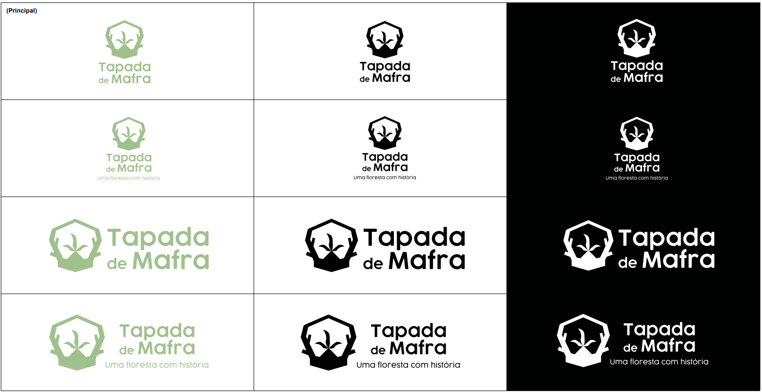
In the end we have 12 different versions of the logo, varying between colored, black and white, with or without slogan, or whether it’s horizontal or vertical.
Colors
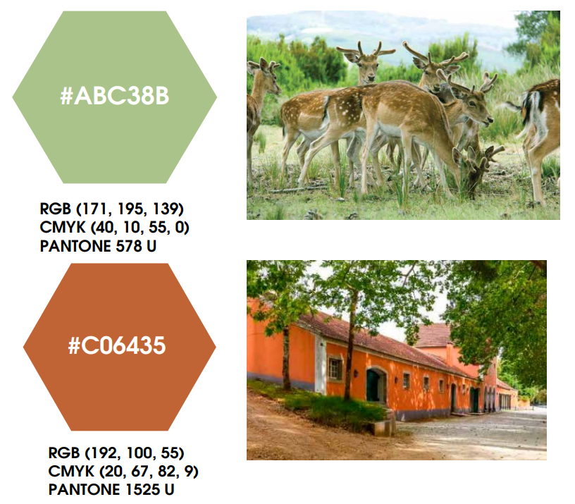
For the two main colors I chose a green to represent the nature of the park, and a orange representing the color of the park’s buildings.
Iconography
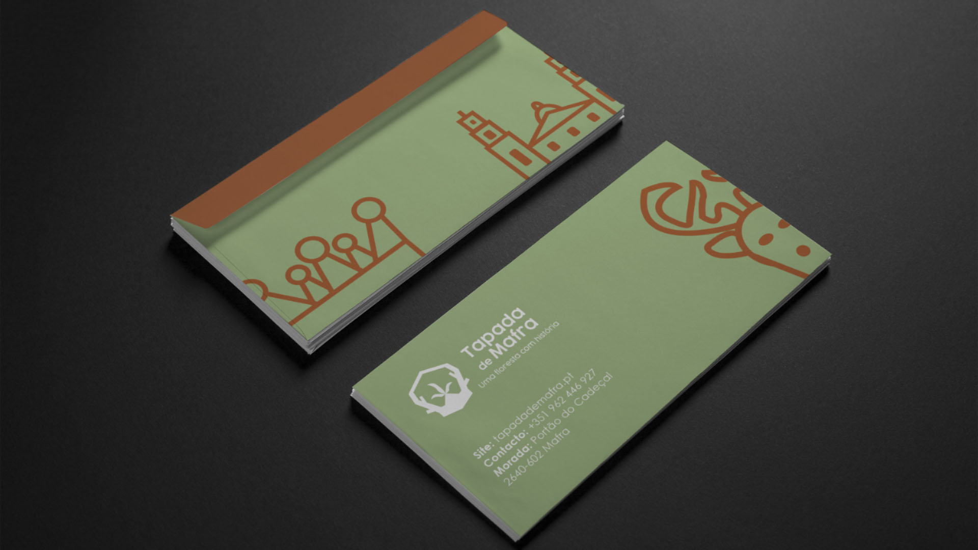
The iconography of the park was divided by four themes, fauna, flora, patrimony and activities
Final Product
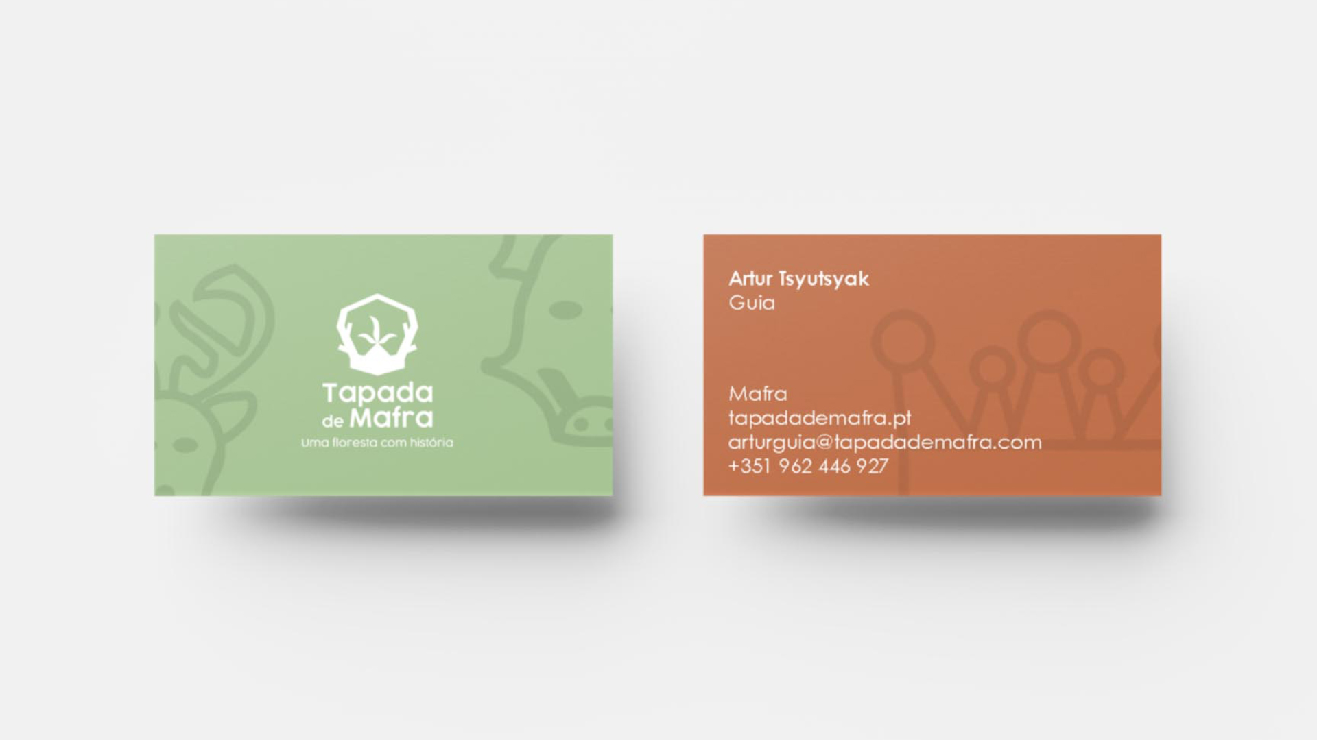
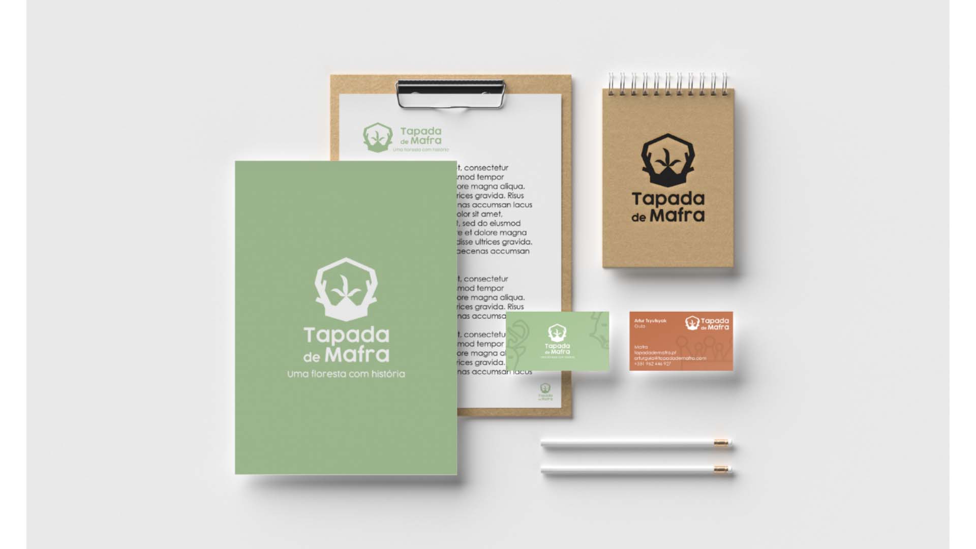
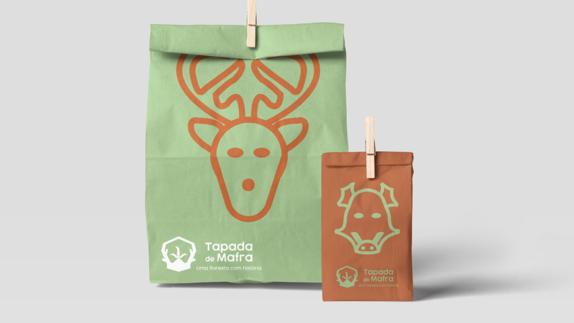
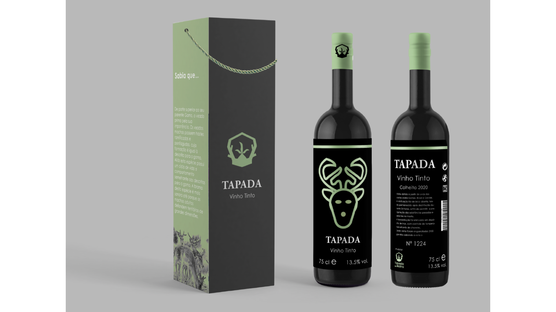
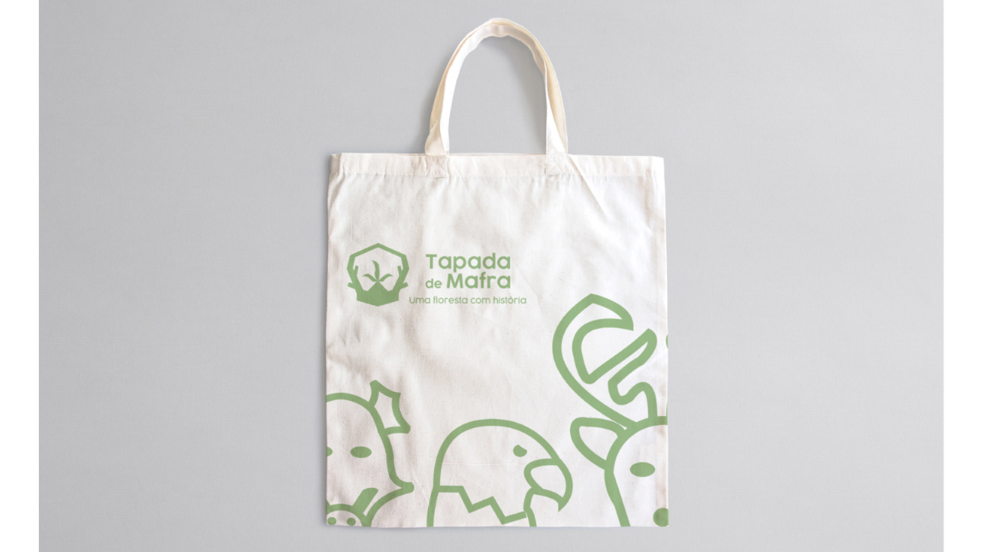
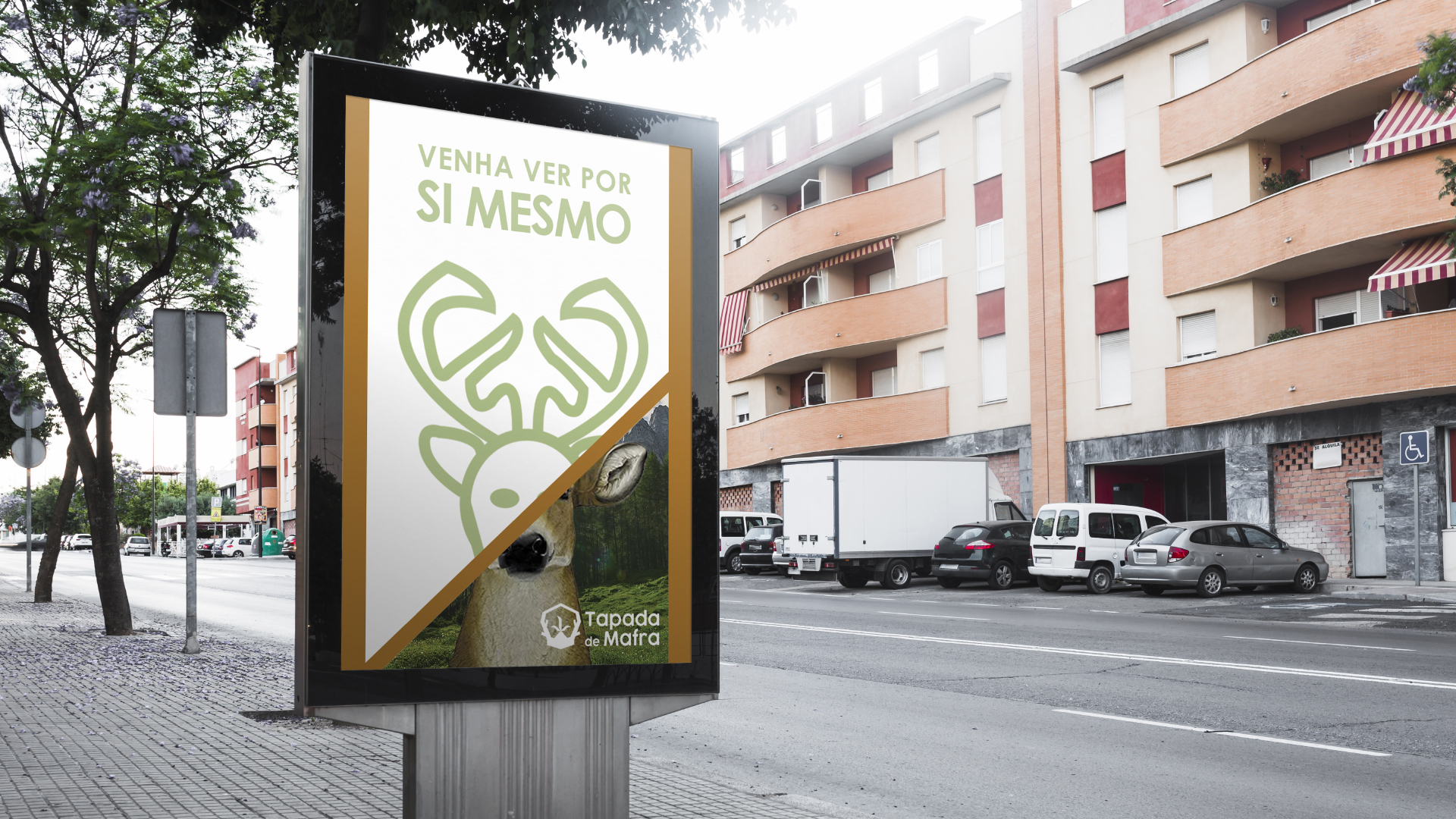
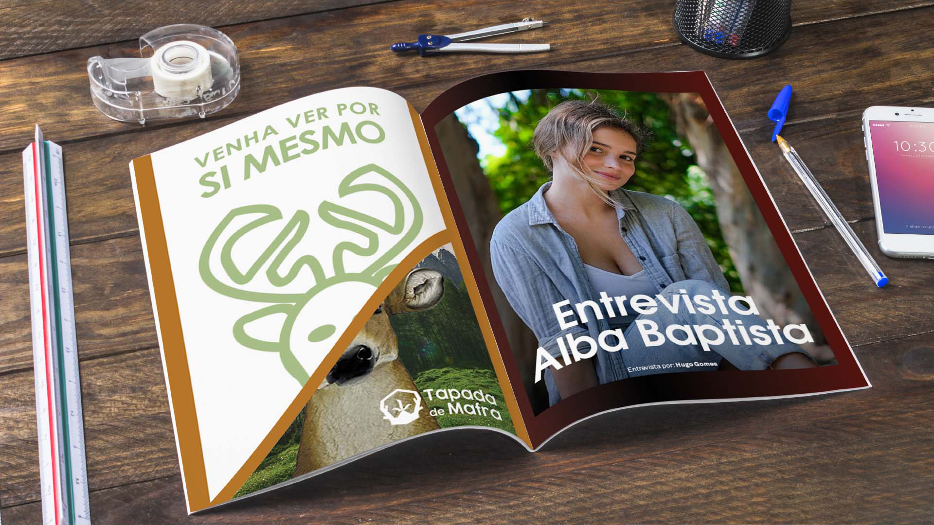
At the end the brand was applied to a variety of products and content, including merchandise and promotional stuff.
